Integrating Tech at Clubs & Tournaments
Project background
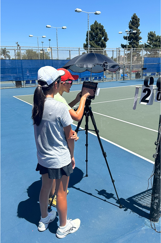
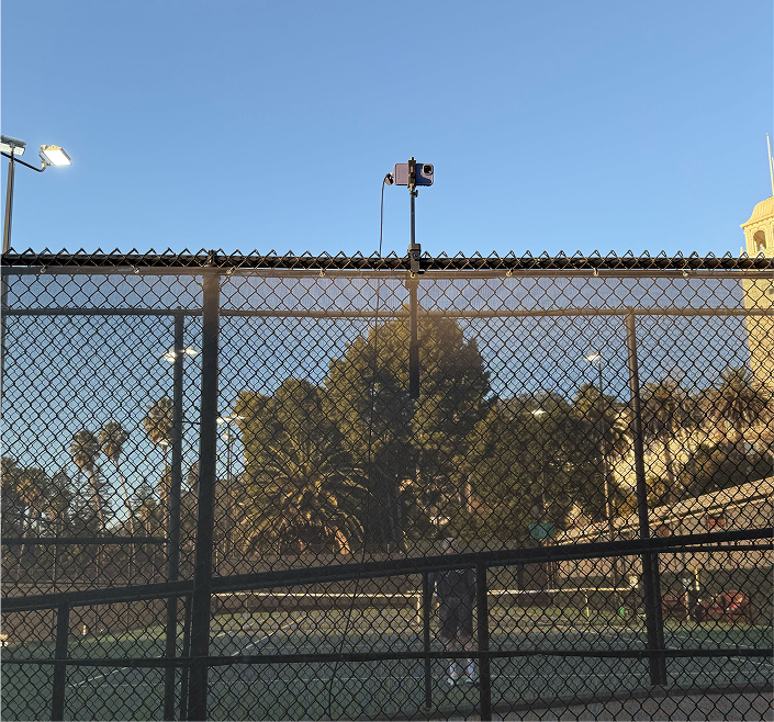
Amateur tennis faces significant cheating which leads to heated on court debates and it isn’t always feasible to hire enough referees due to the high cost. I was brought on to design an affordable, scalable Electronic Line Calling (ELC) platform to address player fairness and organizational overhead.
Results
The designs enabled a new revenue stream, securing 3 major regional contracts and generating +$20k in H1 revenue, while validating market fit by successfully officiating 500+ matches at the junior and amateur adult league level.
New rules and regulations for amateur tennis matches
My role extended beyond product design: I collaborated with the Head of Business Development and USTA SoCal to fundamentally define the governing rules and policies for the new Electronic Line Calling (ELC) system. This effort required concurrent market research into pro tennis (Grand Slams) and amateur systems to ensure our solution was not only fair and transparent but also established a gold standard for tournament experience in a new, regulated environment.
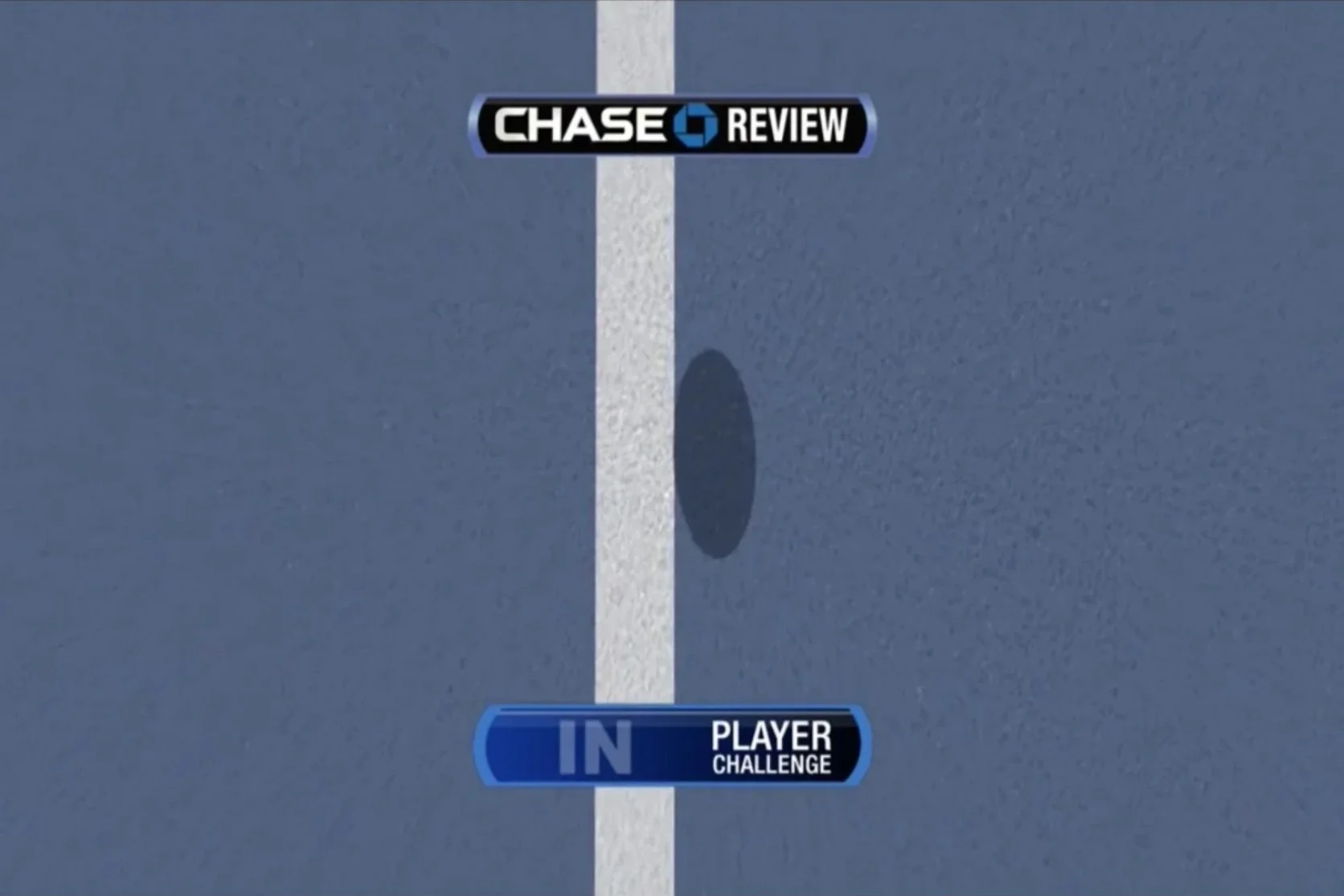
Line challenge review at a grand slam.
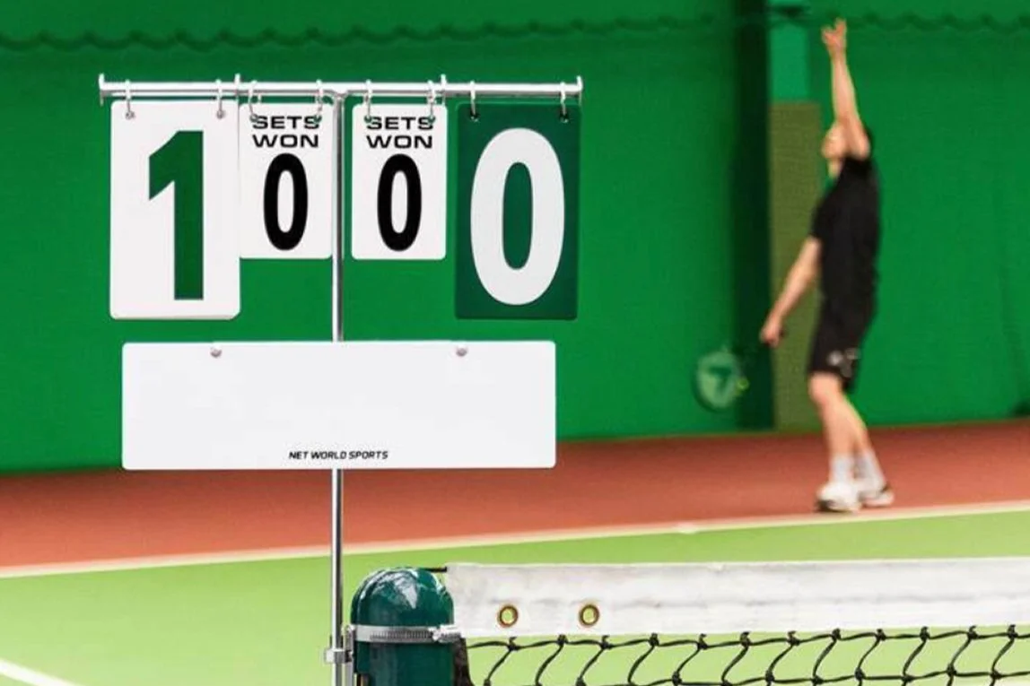
Score is displayed while match is ongoing.
How amateur matches keep score.
Defining the MVP
As a 0-to-1 product, my primary design challenge was to define the MVP to validate the core business hypothesis (reducing cheating/arguments) while establishing the necessary technical architecture for scaling. I worked with engineering and product to prioritize features based on maximum impact to fairness balanced against technical feasibility. This MVP centered on three critical flows.
System credibility & availability
The splash screen was designed not just for branding, but to signal system readiness and professionalism in a high-stakes competitive environment, addressing the need for trust immediately upon interaction.
Core match management & constraint enforcement
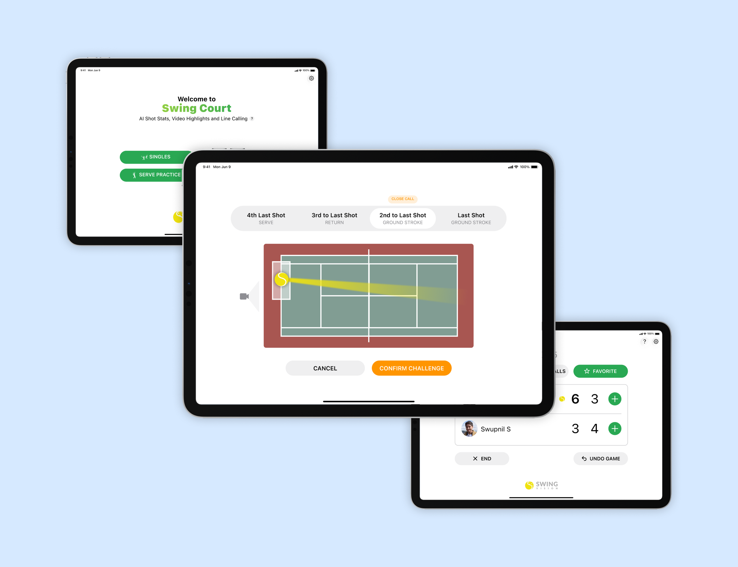
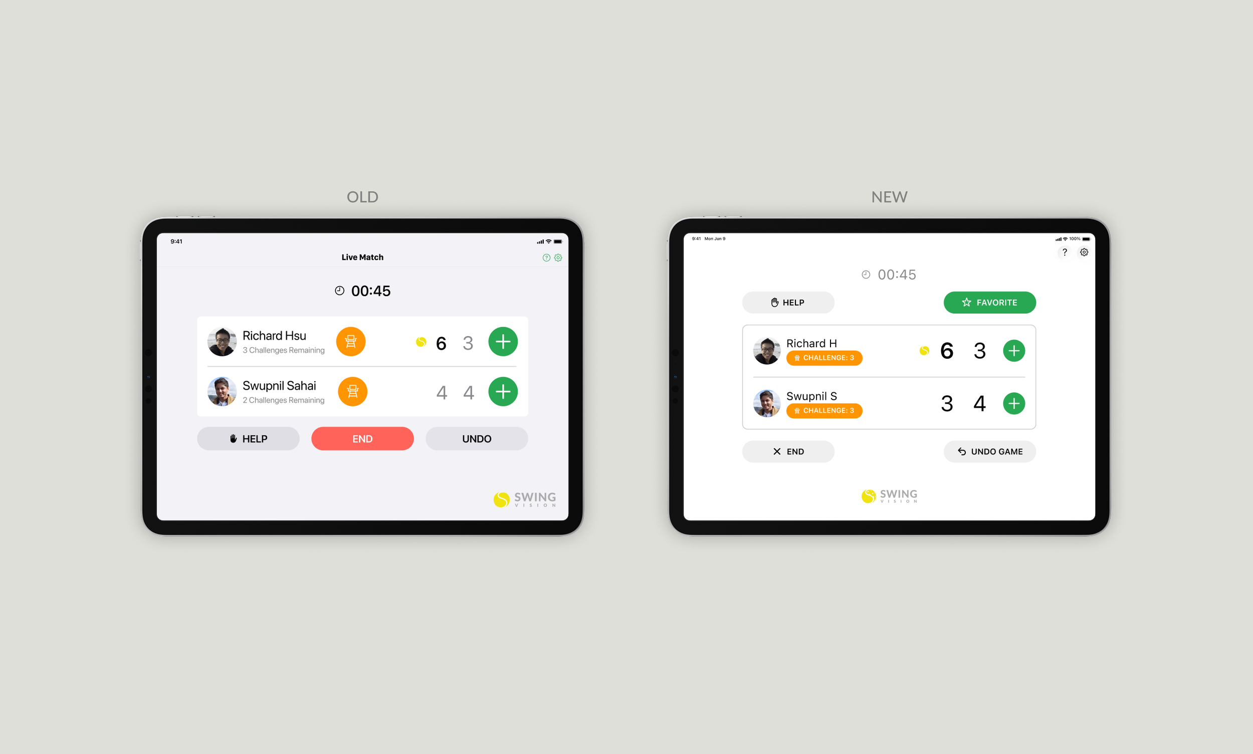
This screen serves as the core command center and is essential for enforcing match rules. It was prioritized to offer just enough functionality - manual score entry and visible challenge limits - to keep the match flowing and validate the value of the ELC system without requiring full automation.
Validating the core ELC flow
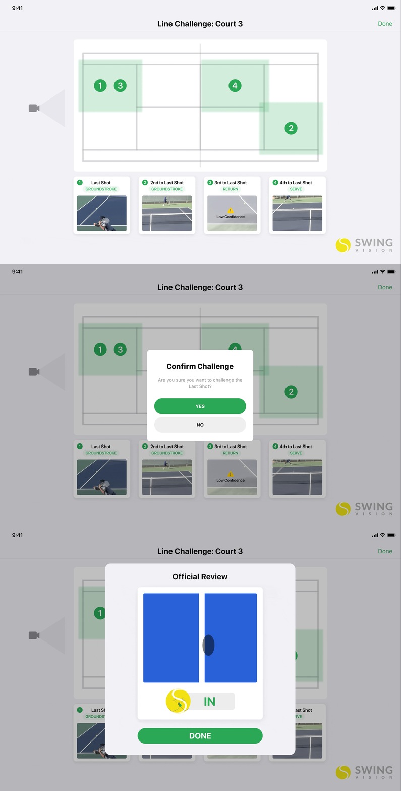
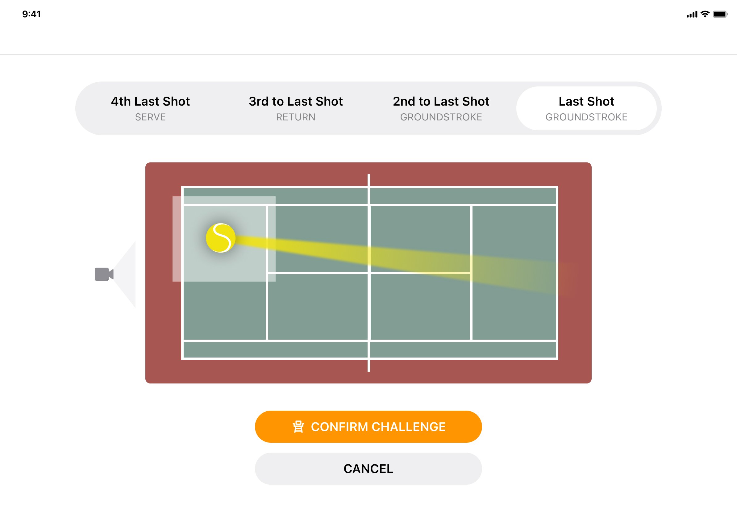
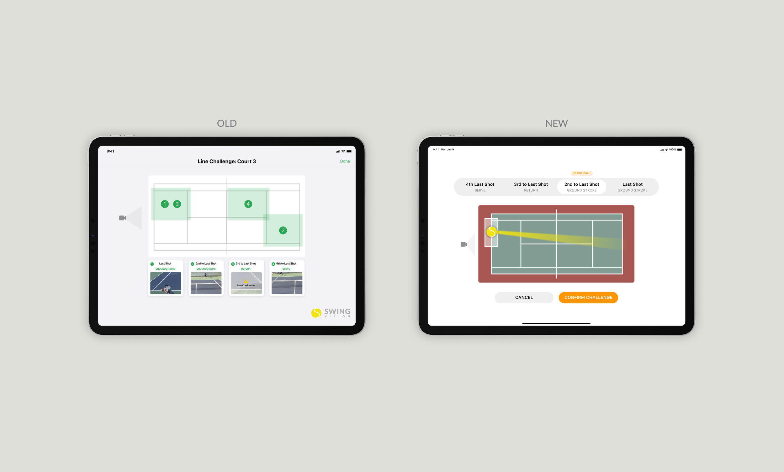
This flow was the single highest-priority feature for the MVP as it validated the core business value: reducing on-court conflict. The design prioritized low cognitive load and rapid decision-making by providing clear visual context (zone highlights, shot type labels) to minimize player confusion and pressure.
Prioritizing User Pain Points as Design Constraints
Initial testing revealed four critical barriers to a successful user experience:
Visibility: Players had difficulty seeing the kiosk screen outdoors due to glare from the sun
Cognitive Load: Players had trouble selecting the right shot to challenge which led to contentious on court arguments and distrust in our system
Trust: Users questioned the accuracy of our line challenge system
Crucially, when players chose the wrong shot and the subsequent review showed the line call was correct, their anger was misdirected at the system's accuracy. This was our fault, not the user's, and created a profound crisis of trust. The highest-priority constraint became immediately clear: we had to drastically reduce the Cognitive Load during shot selection to preserve the credibility of the brand.
Hypothesis: Simplifying Shot Selection
This iteration phase began by de-scoping and replacing the original MVP design (which used image thumbnails on the court along with highlighted zones). That MVP approach proved both technically inefficient (slowing the system by requiring image retrieval) and trust-eroding (users frequently saw a "low confidence" system message, leading to distrust). The goal of these new concepts was to simplify the visual language and restore user faith in the ELC system.
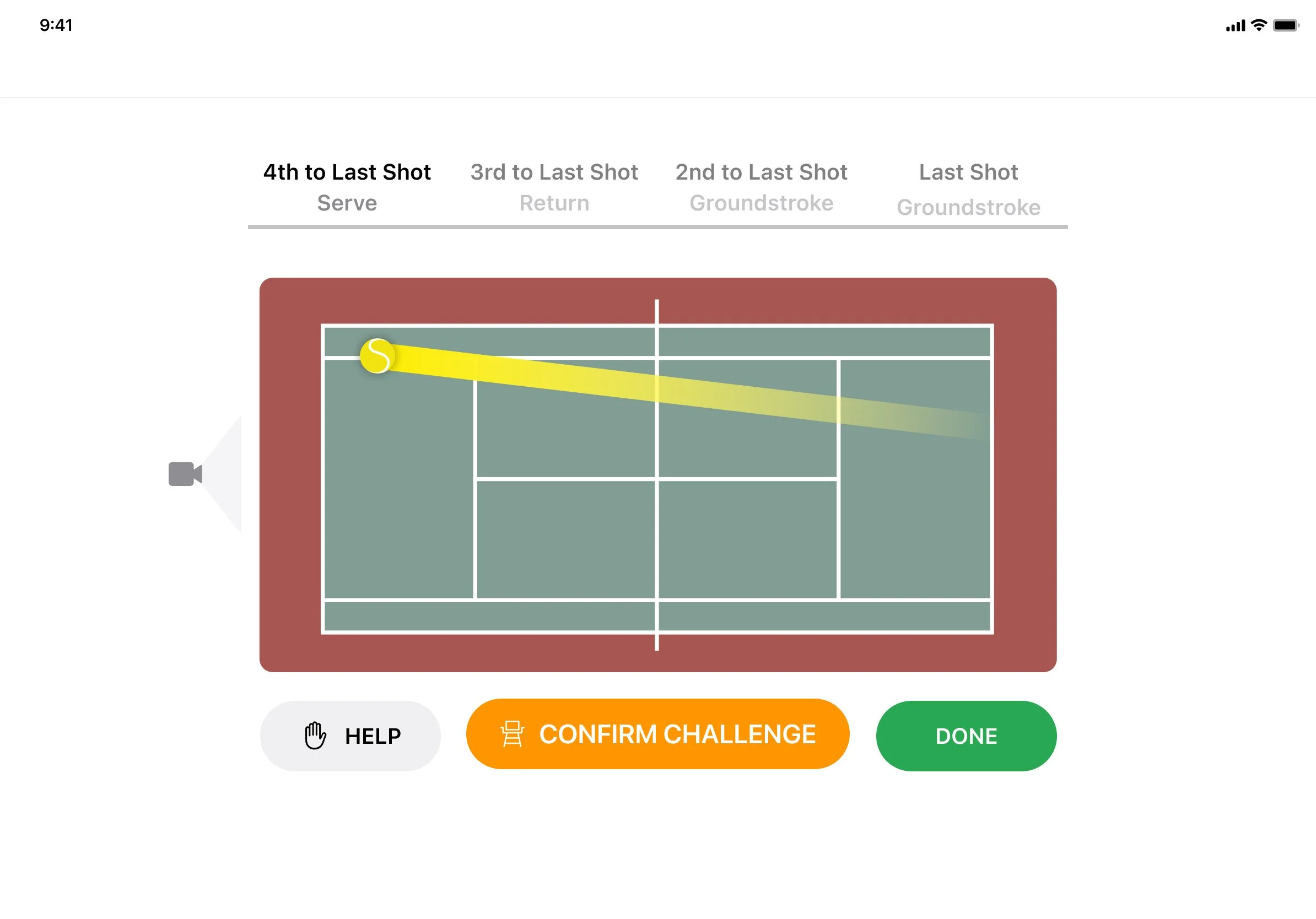
Approach: Inspired by standard web navigation, this minimized visual clutter by using tabs. Trade-off: This failed the visibility constraint for a high-glare kiosk, and the subtle correlation between the selected shot (tab) and the court graphic was too ambiguous for quick, high-pressure decision-making.
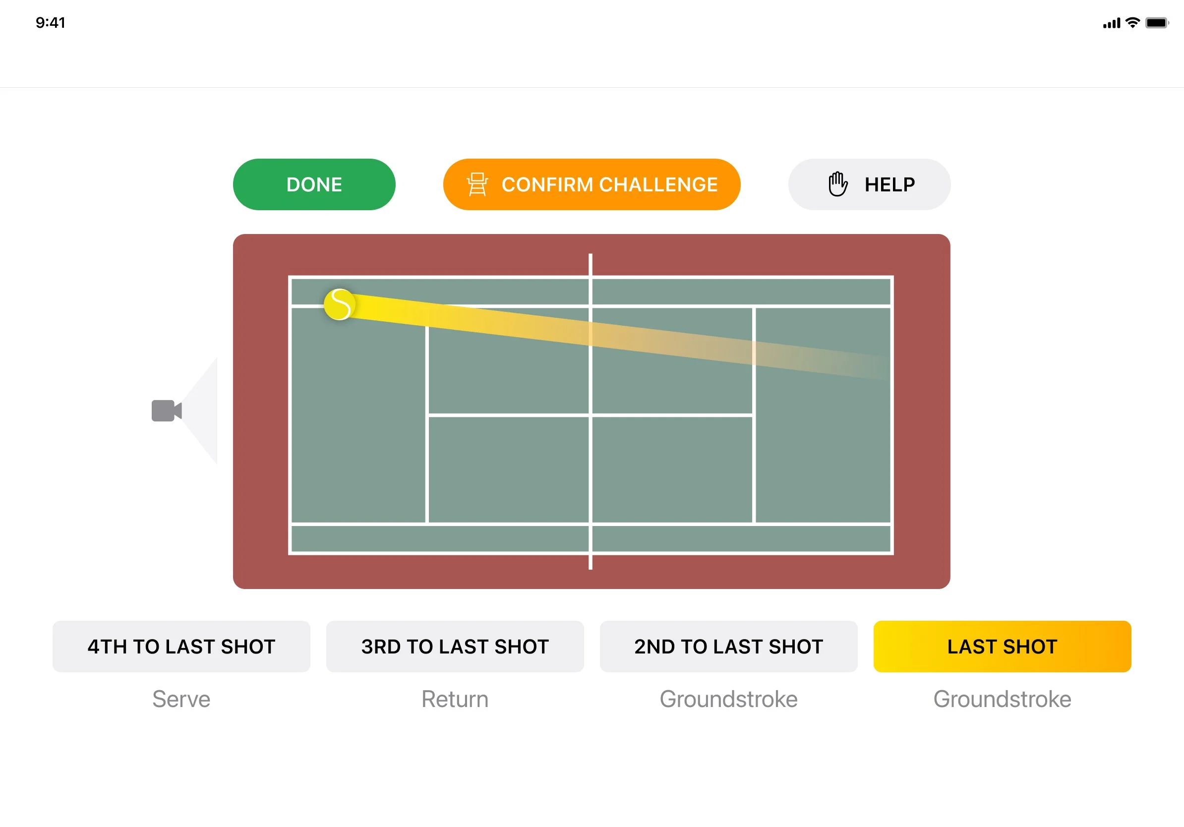
Approach: Focused on connecting the selected shot directly to its landing spot. Trade-off: This still required the user to actively parse multiple landing spots and their corresponding shot labels, maintaining a high cognitive load which risked the user selecting the wrong shot—the core problem we were trying to solve.
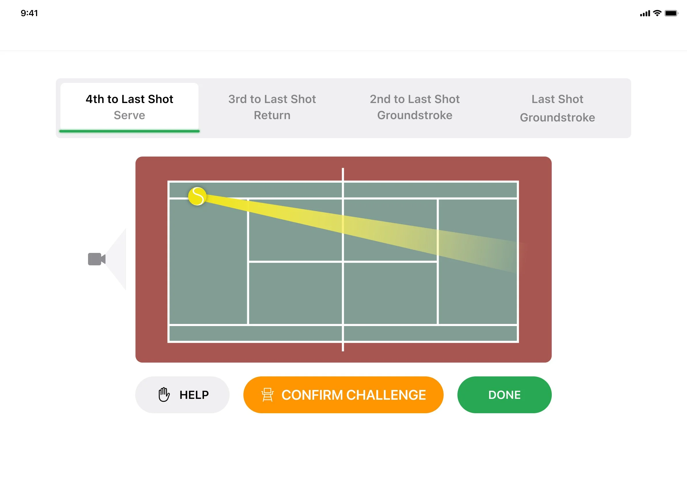
Approach: Introduced a wider ball trajectory graphic. Strategic Rationale: This was a critical pivot based on Machine Learning (ML) constraints. This design provided the ML system with a necessary margin of error (a wider zone) without impeding the user's ability to challenge the shot, proactively addressing technical precision limitations.
This was the winner because it achieved the balance between clarity and credibility. It solved the high cognitive load issue by visualizing the ball trajectory, while highlighting the zone helped keep the line challenge vague before confirming. The wide base of the ball’s trajectory provided the ML system with a necessary margin of error. The segmented control is the optimal pattern for efficiently presenting different views of the same core court data without compromising performance.
Core modifications for the final design
I drove the information architecture update to consolidate critical actions (e.g. merging the challenge button with remaining challenge info). I also advocated for a high-contrast white background and increased text size, prioritizing readability as the primary constraint for outdoor kiosk usage.
Initial testing revealed players struggled with orientation (Hypothesis: too many visual cues). I iterated to focus the user’s attention on a single shot at a time, using the ‘close call’ label as a confidence score to guide high-stakes decision-making.
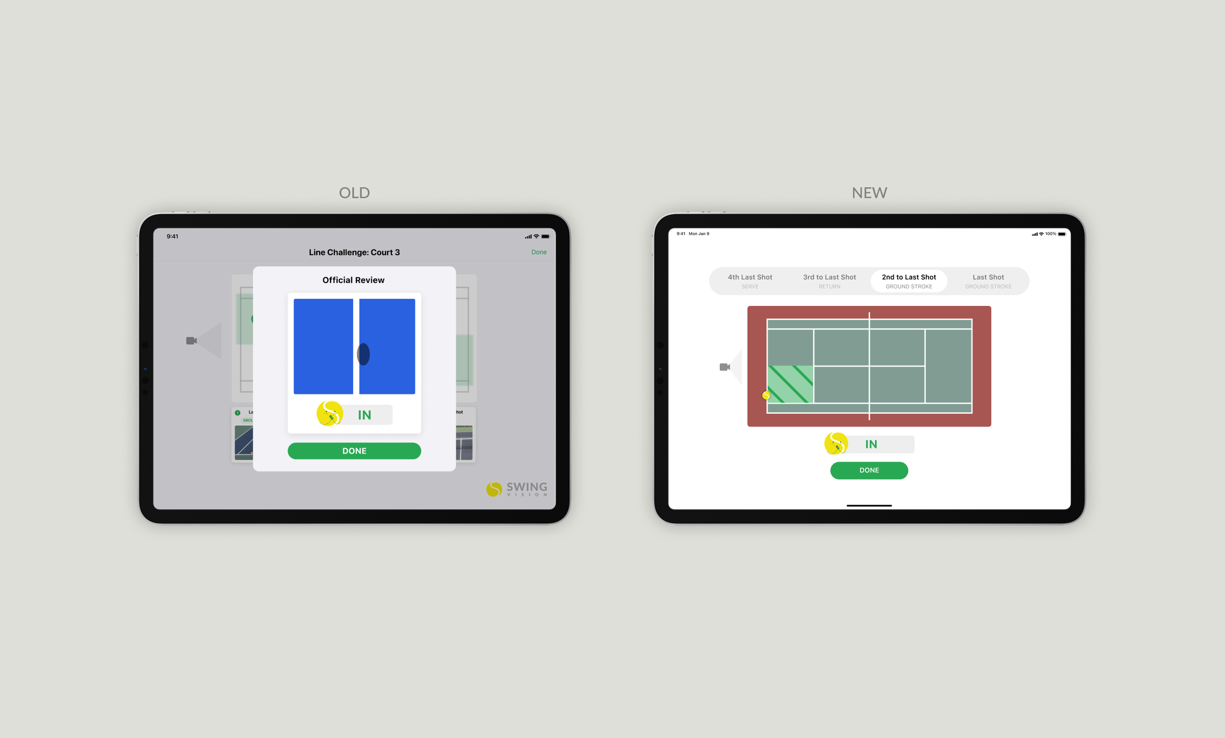
Players questioned the accuracy of the official review. My solution was to move away from close-up (despite grand slam experiences using this, it was confusing players where on the court the ball landed) to a full-zone visualization. This design choice was critical to rebuilding user trust in the system’s accuracy by providing full transparency into the detection zone.
What’s Next?
The ‘Swing Court’ system was designed with platform scalability in mind. We are currently leveraging the existing core detection logic and streamlining the UI components to support the fast-growing Pickleball and Padel markets, demonstrating the flexibility and future-proof design of the original solution.
